|
Please change software listing layout...
|
|
|
tjohns
Newbie

|
8. December 2006 @ 18:28 |
 Link to this message

|
|
The software listing occupies about 3/4 of the screen width, but the description is being squeezed into a now inch or so wide column, meaning that if you're lucky you get 3 items listed down a full screen. Put the description in a spanned row below the other columns, and let it use the full table width that's available.
Trevor
|
|
Advertisement

|
  |
|
|
|
Auslander
AfterDawn Addict

|
8. December 2006 @ 18:46 |
 Link to this message

|
|
out of curiosity, what resolution are you running your compie at? i don't have the squished problems you talk about whatsoever.
|
|
The_Fiend
Suspended permanently

|
8. December 2006 @ 22:19 |
 Link to this message

|
|
Sounds like you need to reset your screen resolution to at least 1024×768 .
The margins look fine to me.
irc://arcor.de.eu.dal.net/wasted_hate
Wanna tell me off, go ahead.
I dare ya !
|
I hate titles
35 product reviews

|
8. December 2006 @ 22:21 |
 Link to this message

|
Originally posted by tjohns:
The software listing occupies about 3/4 of the screen width, but the description is being squeezed into a now inch or so wide column, meaning that if you're lucky you get 3 items listed down a full screen. Put the description in a spanned row below the other columns, and let it use the full table width that's available.
Trevor
I assume you're refering listing pages like this:
http://www.afterdawn.com/software/video_software/video_tools/
It seems that sometimes, specially Firefox, doesn't follow the CSS set for the page, but instead, shrinks the width to be too narrow. In most cases, this wont happen, but at times, it does. This can be fixed by shift+refresh. We don't exactly know what is the issue, but will investigate the problem.
|
|
janrocks
Suspended permanently

|
9. December 2006 @ 00:31 |
 Link to this message

|
Seems that Firefox in windoze has a "shrink to fit" feature that can mess up if the settings are wrong. I get it a lot on certain sites that are built with IE6/7 in mind and never tested with anything else. Dillo seems to solve most of these type issues. I often prefer a plain page anyway (weird oldie)
The solution is to have a good root around in the advanced settings for "shrink to fit" and either enable or disable it!!
|
I hate titles
35 product reviews

|
9. December 2006 @ 00:51 |
 Link to this message

|
Originally posted by janrocks:
Seems that Firefox in windoze has a "shrink to fit" feature that can mess up if the settings are wrong. I get it a lot on certain sites that are built with IE6/7 in mind and never tested with anything else. Dillo seems to solve most of these type issues. I often prefer a plain page anyway (weird oldie)
The solution is to have a good root around in the advanced settings for "shrink to fit" and either enable or disable it!!
Shrink to fit doesn't have anything to do with this case. We actually develop our sites using FFox and just occassionally test the pages on IE (typically to find that IE, once again, failed to render correctly and the page needs hacks to get it working on IE as well). This is something to do with the Gecko engine's likely bug with mixing inline styles and CSS files and handling table widths when the table itself is within another table.
|
|
janrocks
Suspended permanently

|
9. December 2006 @ 06:41 |
 Link to this message

|
Ahh thanks for clearing that up. I was wondering why it looked so different at work on windows. I was sort of thinking out loud because mozilla browser with the settings wrong can make a real mess of some sites.
Reflow bugs in the Gecko Rendering Engine There is a bug in the Mozilla.org core code which causes Firefox 1.0 and Mozilla Suite 1.7 to crash when viewing certain websites. This bug is fixed in SeaMonkey 1.0 and Firefox 1.5 but not in Firefox 1.0. For further details see mozilla bug 228557 https://bugzilla.mozilla.org/show_bug.cgi?id=228557
Suppose it all depends which version of FF he is using. The only way I found to obtain badly formatted software pages was by messing up shrink and screen res settings. It never hurts to check browser settings when something doesn't look right.
The original poster has done exactly the right thing by bringing it up. I love it when people give feedback to make things better.. ;-)
This message has been edited since posting. Last time this message was edited on 9. December 2006 @ 06:45
|
|
tjohns
Newbie

|
13. December 2006 @ 20:20 |
 Link to this message

|
I'm running XP at 1024x768, and since it does it in the latest IE7 as well as Firefox 2.0 I thought it must've been a site issue...

Trevor
|
|
janrocks
Suspended permanently

|
14. December 2006 @ 09:24 |
 Link to this message

|
|
This message has been edited since posting. Last time this message was edited on 14. December 2006 @ 09:25
|
|
tjohns
Newbie

|
15. December 2006 @ 03:56 |
 Link to this message

|
|
If that's the way it's SUPPOSE to look, fine. I was just thinking that it would be a better use of space to have the description spanned across the whole table width (in 2 or 3 lines) rather than have a 9 line description down a narrow column (and making the row for each item 50% whitespace).
Trevor
|
|
janrocks
Suspended permanently

|
16. December 2006 @ 13:02 |
 Link to this message

|
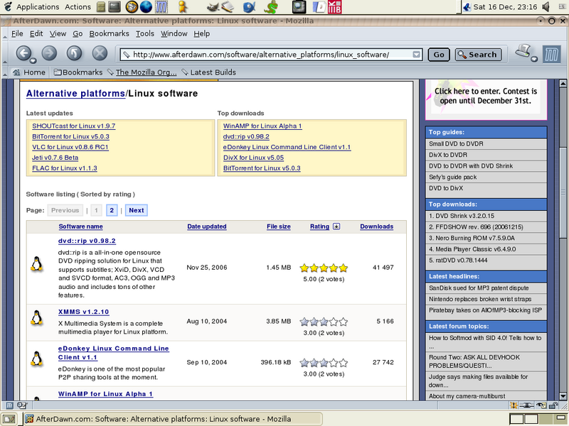
It's interesting.. On yours the panel didn't fit the space allocated for it, and crammed everything to the left. I know AD is tested with FF on linux so I only posted that as a comparison of the slight differences.
Your image has gone so I'm working from memory.. Which FF are you running, because there seem to be a few little bugs in 2.0...
edit Seems like your image server was having a blonde moment.. Now it's back I can see that you are using that broken m$ thing that doesn't render sites properly 70% of the time. From what I can tell..only IE has these page layout issues, probably because m$ think they are above complying with standards.
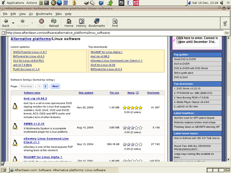
Exactly the same page as above in mozilla..

And in epiphany

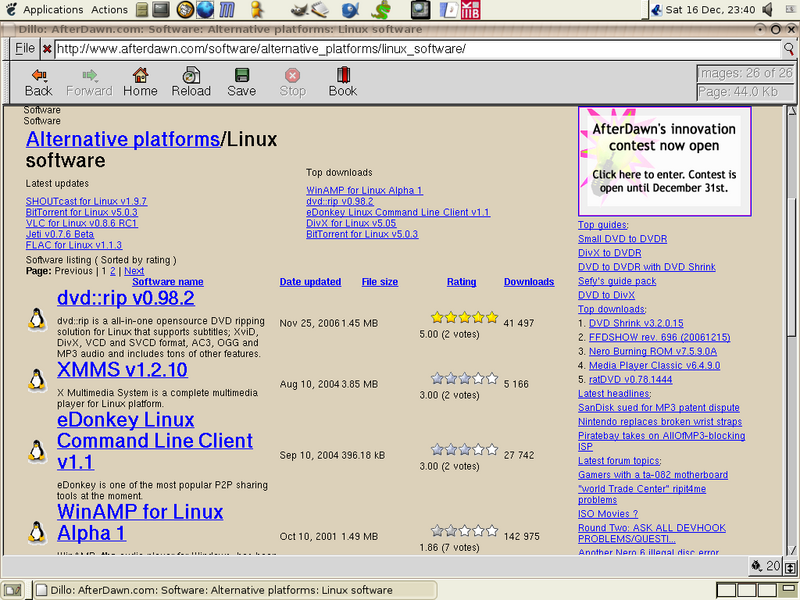
Of course for culture-shock there's Dillo...

This message has been edited since posting. Last time this message was edited on 16. December 2006 @ 13:52
|
|
tjohns
Newbie

|
16. December 2006 @ 20:26 |
 Link to this message

|
Sorry if I'm not making myself clear here, but in my option THEY'RE ALL DOING IT WRONG! I think the App Name, Date, Size & Rating should be in a single row across the table together (as they are now), AND THE DESCRIPTION SPAN THE WHOLE TABLE WIDTH BELOW THEM IN A "ROW" OF IT'S OWN! This would mean most entries would only need 2 or 3 lines of description at most, and hence allow more entries to be visible on the screen at once. Here's a mockup of what I'm on about...

Trevor
This message has been edited since posting. Last time this message was edited on 16. December 2006 @ 20:40
|
|
janrocks
Suspended permanently

|
16. December 2006 @ 22:20 |
 Link to this message

|
|
I do understand what you are getting at, and it's a good idea. I just find it interesting about the strip of empty space right in the middle of the page.
|
I hate titles
35 product reviews

|
16. December 2006 @ 23:09 |
 Link to this message

|
|
As said, the white space on the right that happens every now and then is the bug I mentioned, it has something to do with CSS entries conflicting and we don't exactly know what causes it, thus can't say how to fix it. Our gfxer will spend a week or two, until it gets somehow sorted, around beginning of January to address the issue. The bug happens on both, FF and IE and on both, it can be "solved" by reloading the page with shift+refresh method, which forces the browser to reload the styles.
|
|
tjohns
Newbie

|
17. December 2006 @ 22:12 |
 Link to this message

|
|
The refresh doesn't help, as there's actually an advertising image at the top of that "space" that's reducing the table width further. Do "paying" users get an ad-free site, and therefore see things differently to the rest of the public?
Trevor
|
|
tocool4u
Suspended permanently

|
18. December 2006 @ 13:33 |
 Link to this message

|
|
This site is totally free. There is no extra fee to pay to get certain privilages or anthing like that.
|
|
janrocks
Suspended permanently

|
18. December 2006 @ 14:40 |
 Link to this message

|
|
Ahh..an ad. That would expalin lots. I run heavy script blocking and ad blockers in my browsers. I forget that there are such things that others see, and that mess up layouts.
The boss has noticed our discussion so I'm sure the matter is being considered.
|
Staff Member
2 product reviews

|
19. December 2006 @ 18:03 |
 Link to this message

|
Originally posted by tjohns:
Sorry if I'm not making myself clear here, but in my option THEY'RE ALL DOING IT WRONG! I think the App Name, Date, Size & Rating should be in a single row across the table together (as they are now), AND THE DESCRIPTION SPAN THE WHOLE TABLE WIDTH BELOW THEM IN A "ROW" OF IT'S OWN! This would mean most entries would only need 2 or 3 lines of description at most, and hence allow more entries to be visible on the screen at once.
I'm happy with the way it is now, but given the number of entries you get on a single page sometimes I can see the benefit of you suggestion.
|
|
Advertisement

|
  |
|
|
tjohns
Newbie

|
19. December 2006 @ 19:51 |
 Link to this message

|
|
Okay, just to finish this topic off, it appears the ONLY two lists that have the extra advertising in them to reduce the column width are the TOP DOWNLOADS and LATEST UPDATES shortcuts on the menubar below the tabs ... and guess which links I tend to click on!!
BTW, while browsing some of the other topics I did encounter the "phantom" extra space next to the table, and a simple refresh did do the job in those cases.
Trevor
This message has been edited since posting. Last time this message was edited on 19. December 2006 @ 19:56
|


